Experience the power of Luzmo. Talk to our product experts for a guided demo or get your hands dirty with a free 10-day trial.


July 17, 2023
Bruno Verbruggen
Read our 5-step method to craft the perfect SaaS sales dashboards. Explore 6 SaaS sales dashboard templates you can reuse!
If you’re selling a good SaaS product, it doesn’t necessarily make you a good salesperson. But needless to say: it certainly helps.
To build an A-class SaaS sales team, you need to provide them with the right ammunition. A good product & sales content is crucial. In addition, at Luzmo we empower our team with a sales dashboard to take the right actions.
In this article, I won’t elaborate on different sales strategies and techniques. There are enough good sources and experts like Michael Humblet (Chaomatic) or Steli Efti (Close.io) on that subject. More specifically, I would like to share how we, as an analytics company, use data and dashboards to sustain the sales growth of a scaling SaaS company and sales team.
PS. This article was written by Bruno Verbruggen, the Head of Revenue Operations at Luzmo.
At present, every SaaS company feels the need to be on top of its metrics. Moreover, sales metrics are usually top of mind when it comes to tracking the performance metrics of a growing SaaS business. Whether it’s to keep an eye on your revenue growth or to report to your investors.
As a sales manager at an analytics company, I’ve helped lots of people from different SaaS industries with their dashboards. And that’s the thing I love most about my role.
Every client or prospect has different needs and use cases. Being in contact with them helps you to understand the needs and translate them into specific dashboards.
However, many times we’ve seen Luzmo clients come up with a creative solution of their own for a team performance dashboard. I love it when this happens. Especially if we know another client who might benefit from this too. Or when it’s a sales-related case and we can implement it in our own processes.
Why am I mentioning this? Well, just to show you that your network is a great place to gather inspiration for your own sales dashboard.
Research online how other SaaS companies do it or simply discuss it with other SaaS enthusiasts you’re connected with. This worked for us, as well as for our clients.
You’ll get plenty of inspiration for your sales dashboard in this post. But your SaaS network is a great source if you need any additional ideas.
Inevitably, I’ve learned a lot about analyzing the SaaS sales funnel. Not only within our own company but also while working with other SaaS companies who are trying to get a grip on their sales process by analyzing all of their data points.
So, where do you start? Firstly, you’ll need to gather all the data that are related to sales in your company from all the relevant data sources. Here are some tips on where to find it.
Your CRM system is usually the best place to start. For me as a sales manager, it contains all the data that’s most important to me related to sales analytics.
Our leads, customers, the sales stages they are in, actual and projected revenue, and I could go on for quite some time. Bringing those together in a structured sales dashboard with real-time data will help you and your team a lot.
To give you some context: we are a scaling SaaS company with a relatively complex sales cycle. We use Hubspot as our CRM platform, which is great for marketing & sales alignment. In addition, we have experience with Teamleader and Pipedrive, of which I’m a big fan too.
Import all of this CRM data into your business intelligence tool. We use our own embedded analytics platform for this, but you can basically use any BI tool to do so. Just make sure to check if they have integrations with the systems you’re using. And voila,
Your stack of sales tools consists of more than only your CRM. For example, if a lot of your sales happen through indirect partner channels, your CRM alone won’t do.
In that case, you’re probably using – or we would strongly advise it – a BRM system (Business Relationship Management) to manage your partners. Without the data from your BRM, you will miss part of the picture, leading to inaccurate data views and a lack of actionable insights.
So, before you dive into your data, think of other sales tools you are using to extract valuable data. To list a few:
If you still use Excel or some other form of spreadsheets for your data - it’s high time to get into the 21st century.
Once you know where to find that sales data, it’s important to gather them all in one place. Ideally, you store it in a database that can be used for reporting. There are a number of good database solutions for reporting.
You can use tools like Zapier or Blendr.io to sync data from different sales tools to a database.
Which sales metrics are most important to you, will probably depend a lot on your business. If you’re an early-stage SaaS, MRR, and acquisition of new revenue will be your primary goals. In the scaling phase, it makes sense to measure sales trends like annual contract value or average deal size.
There is no strict set of sales metrics you should follow. Instead, keep in mind the sales goals for your team and align your sales metrics directly. This will set you up for success.
To exemplify, you’ll find an overview of the most common sales metrics for SaaS businesses that need a sales KPI dashboard.
You have your data in place. You know your key metrics. Now it’s time to present them visually in some type of sales performance dashboard.
Nowadays there are many BI tools on the market that let you handle this with simple drag & drop.
Bonus tip: are you also looking to share dashboards with clients as part of your SaaS offering? Some BI tools, like Luzmo for example, also let you embed dashboards into your own application. Hit two targets with one shot and get your sales data in real-time!
When it comes to creating a sales dashboard, I recommend checking out some basic best practices for data visualization. You can use various types of graphs, charts, tables, and other ways to drill down data. Because there are multiple good resources on the topic, I won’t tackle this here in more detail.
What I do want to share is a toolbox of ideas, tips, and tricks that worked for us. Given most of my experience with sales dashboards is hands-on, they might prove useful for other sales managers too. However, I really believe that your own creativity is the key to success here.
In no way I’m meaning to say that the metrics we’re about to discuss will work for every company, for every sales process, or with every CRM platform.
Even our own setup is still highly dynamic. We regularly make changes to our sales dashboard, based on our current sprint, team, and challenges so we can automate the most tedious bits and focus on high-level metrics instead.
So, let’s touch on a couple of examples of what a sales dashboard could look like. We’ve listed 6 examples below, and explain how we use them in our SaaS sales team.

This sales dashboard is one of our most used dashboards. It shows the pipeline, sales process, and action points for each sales rep - all relevant sales key performance indicators for a SaaS business to track. The dashboard rotates on a large screen in the office the whole day, so everyone is on top of their pipeline.
In most of these analyses, we use a concept we call ‘Touchpoints’. A sales touchpoint is any action we can link to a specific deal. For example, an email, a live chat, a phone call, or a meeting. It always has a specific date related to it.
Most CRM systems provide the tracking of these actions by default. However, we combine this info with our additional communication channels such as our support chat – we use Slaask for that – or marketing emails. Furthermore, these touchpoints allow us to create proxy concepts like ‘last touchpoint days ago’ or ‘planned touchpoint in days’, …
Internally, we have guidelines on actions to be taken on deals in a specific phase. For example, every new deal needs to be contacted within 48 hours. This way, we can understand his needs and goals immediately and help them more efficiently just by looking at sales reports.
All of this translates into a specific sales dashboard, set up with filters per employee. In that way, each colleague can get a visual representation of their pipeline. Internally, we don’t do micromanagement as it hinders sales productivity.
And we surely don’t track the history of these dashboards to use them in employee evaluation. We use these sales dashboards solely for motivation or assistance as they almost literally can speak: ‘Hey – start reaching out, Bruno’.
When I asked my colleagues, they found the following charts most useful.
As mentioned, our sales reps have a target to contact new leads within 48 hours. Simply put, this gauge chart below will turn red as soon as one of your new leads it is overdue. This way, you immediately know when to take action on calls or follow-up emails. Additionally, try to enhance email deliverability and ensure your emails reach the inbox successfully by implementing an SPF record checker and taking other steps.
Again, this is a barometer of how actively you are contacting your deals. If inactivity is higher than average, some deals might be frozen. Maybe to death. 🥶 Or, you should urgently make time to reach out to your prospects.
This funnel shows you visually how deals are distributed across colleagues. Imagine one colleague has 40 deals in the pipeline, and a second one only has 8. Then it’s in everyone’s best interest to transfer deals.
The same goes for the funnel distribution. If one colleague had 70% of his deals in the initial stages and another one has most of them in the late stages, a swap of deals might be relevant.

We’ve been using this sales dashboard since we started Luzmo. It kind of feels like a life-long partner in crime. It’s used to measure evolutions in our sales pipeline over time. It’s especially useful to spot larger trends:
For strategic decision-making. With all different teams involved, we actively discuss this interactive dashboard during quarterly evaluation meetings. It is the main driver for the optimization of our sales process.
Although it’s not limited to sales only. For example, should we see a drop in our close rate – we might need to take action on:

We rotate a world map with the global locations of our current clients at the office. Why? First and foremost, it looks awesome. Secondly, it constantly reminds us of our international aspirations. It motivates everyone in the company to open up new markets in new regions.
In addition, it’s useful when we plan an on-site visit with a prospect or client. We can quickly check whether their other clients have offices nearby, so we can pay them a courtesy visit. This greatly helps the relationship building with our customers!
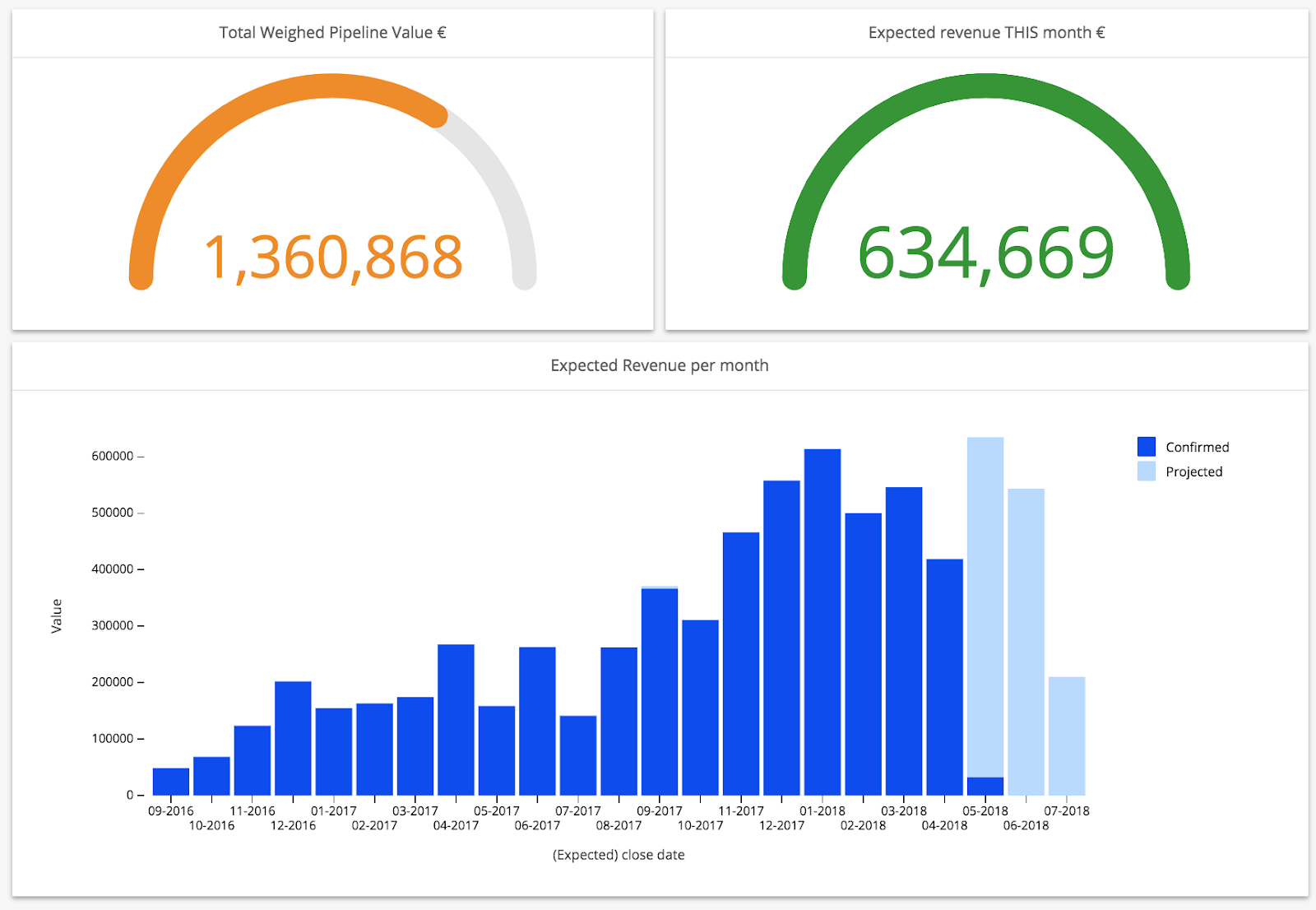
Another sales dashboard we actively use is our expected cash flow dashboard. As sales leaders, you’ll want to know which revenue you’ll get out of your existing pipeline in the coming months.
Some CRM platforms offer such a prediction analysis. However, a forecast is very specific to the company itself. Thus, it needs some tinkering for each specific case.
Forecasting is too often based on guesswork. Therefore, we came up with a quite accurate way to calculate this. It will need some explaining, but the model is based on 2 things:
Basically, you want to calculate how probable it is that a deal will convert into a paying customer. It’s simple: a deal that just started a trial is less probable to convert than a deal you’ve qualified through 3 sales calls.
So, we “weigh” the value of your deals based on where they are in your sales funnel. In other words, an early-stage deal is worth less than a proposal made.
To calculate this ‘Weighted Value’, we first need to know our historical probabilities, which we calculate as follows:
Historical Probability for Phase X = (# deals that ever went through Phase X and are now WON) / (# deals that ever went through phase X and are now WON or LOST deals).
The ‘Weighted Value’ is then equal to Historical probability phase X * Deal value
To accurately forecast, you need to know when you will be closing deals. Therefore, we need to calculate an ‘Expected Close Date’. To do so, we use our historical average of ‘days to close’. If you have different pricing plans, it makes sense to do this for each plan individually. An enterprise deal takes longer to close than an early-stage startup.
An alternative is to use the ‘phase’ as a variable again, and calculate the average days it takes to close a deal after it got in this phase. You can also use a sales funnel calculator to do the heavy lifting for you.
We loop this sales dashboard on a TV monitor in our office. This way, we can check at any moment if the current pipeline will suffice to reach our sales target that month.
If it doesn’t, we can directly take action. For example, we can launch new campaigns on specific target groups together with marketing. Or, at the end of the month, the sales team can put extra effort into closing late-stage deals faster than average.
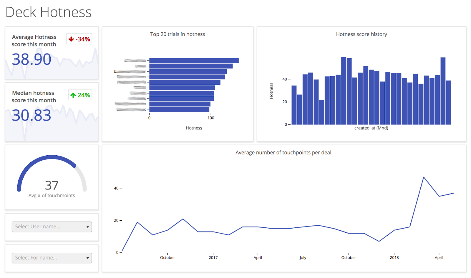
This dashboard is basically a tool to track the buyer intent of someone who started a trial on our platform. It’s a combination of two concepts:
We combine those two into a ‘Deck Hotness score’. This is one single number on an arbitrary scale that indicates how likely a trial will convert into a paying customer.
The dashboard also rotates on our screen – right after the cash flow projection. If trials are less engaged than average, we may undershoot our sales target for that month.
If you’re aware of those numbers, you can take action immediately. For example, organizing a webinar on a specific subject or improving the platform onboarding.

This last sales dashboard is actually the odd one out. We don’t use it ourselves at Luzmo, because we don’t do time-tracking. However, we’ve seen this work for many of our clients, so it’s definitely worthwhile to share.
This time-tracking dashboard gives you insight into how much of a time period a sales representative spends on a specific project, client, or sales activities. Which sales processes are taking too long? Are your sales reps spending too much time on specific deals without any outcome? These are great insights to optimize how your reps spend their time.
If you’re offering professional services or consultancy work, you can also use this dashboard to track billable hours. This is great to spot upselling open opportunities with clients that are already getting a lot of support.
As I already mentioned, I am anything but the next sales guru telling you how to do sales. When it comes to your own business, you are the true and only expert. Like no one else, you know best what works well for your company!
These example cases are just to inspire you to be creative with your own data. Firstly, be creative in the setup of your sales dashboards, with KPIs that support your business goals.
Secondly, be creative in finding solutions to the things your data is telling you. For us, it really changed the dynamics in our team and the way we do business.
What about you? Are you already using sales dashboards in your SaaS company? Do you have cool examples of dashboards you’d like to share with other sales managers and stakeholders in your company?
Would love to hear your ideas and thoughts in the comments!
If you want to get started with the sales dashboards discussed above, don’t hesitate to get in touch. You can also start a free trial on our platform; my team members will reach out to you if you’d need any help.
Experience the power of Luzmo. Talk to our product experts for a guided demo or get your hands dirty with a free 10-day trial.


