Experience the power of Luzmo. Talk to our product experts for a guided demo or get your hands dirty with a free 10-day trial.


May 29, 2019
Lander Haspeslagh
Data insights help you save time and costs on logistics processes. Make smarter decisions with these 5 maps for logistics data visualizations.
There are a lot of ways to visualize all kinds of data. Some visualizations more suitable and clear than others. This highly depends on the type of data you are visualizing.
In logistics, geospatial data is used a lot. Geospatial data is a kind of data that has an implicit or explicit association with a certain location. For example routes, concentrations of certain people/stores… on different locations.
Because these kinds of data have a geographical dimension, it is ideal to visualize it using maps. Here are 5 examples of how to visualize your logistics using maps.
In logistics there is often a certain route that has to be completed. The challenge is often to make that route between different points as efficient as possible.
These activities, such as pickup and delivery operations and waste collection, can often be optimized using route maps and real-time kinematic (RTK) GPS technology. The main idea of these route maps is to optimize and plan your route so you spend less time driving and more time doing the actual job. It saves a lot of time and gas money, making it a very valuable tool.
This chart below visualizes the route of a truck that has to deliver goods to Belgian cities. The orange and red parts of the route mean that there is a traffic jam at that moment. It can be a trigger for the transportation company to decide to do an alternative route. It’s always important to get insights in data to make certain decisions.
A heat map is a kind of data visualization that uses color the way a bar graph uses height and width. For example when there is a place in the world/continent with a high density of people (or any other metric) the color will be warmer. When the density is lower the color will be more cold.
Heatmaps are probably one of the most used data visualization tools for maps in particular. They are everywhere these days, think about the weather forecast. Another example of how heatmaps are used is in marketing: it can visualize where people look at the most on your website.
Also in logistics it can be a really good tool to use. The heatmap below shows the hotspots of sales across the world. It visualizes the number of orders per country. Alternatively, you could have made a list of countries or regions with the highest number of orders. However, with this kind of map, it’s very clear how sales is spread geographically in the blink of an eye.
Another example of data visualized on a map is the Choropleth map. A choropleth map is a kind of map where some areas are darker or lighter in proportion to the measurement of a certain statistic variable being displayed on the map.
This kind of visualization provides an easy way to show how a measurement varies across a geographic area. An example of this can be the percentage of goods sold per country, as shown above. When a certain country has a higher ratio of goods sold versus in stock, the color will be darker blue, when a country has no sales, the color will be white. A country with a lower amount of sales will have a very light shade of blue.
The goal here is to see in a few seconds in which countries you are doing well and in which countries you might have to put a little extra effort in.
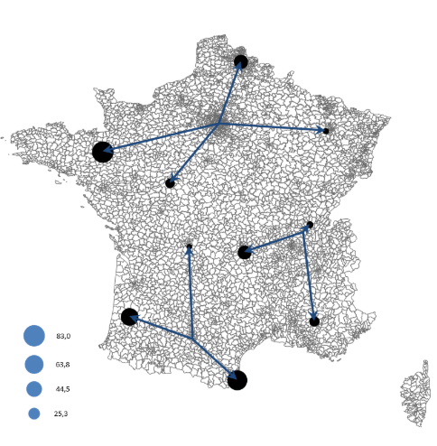
Next in line are flow maps. They are a type of map that can be used to show the movement of objects between different areas.
They can be used in many different occasions, for example to track the number of animal species in a specific migration pattern. Usually, however, flow maps represent the movement of goods, weather phenomena, people and other living things with line symbols of different widths.
For logistics companies, it can be a very useful tool to show the movement of shipped goods to the distributors or clients.
Last but not least, we will cover symbol maps as well. As the name says, symbol maps are simply maps that have a certain symbol (often circles) on certain countries. The symbols will be bigger or smaller in proportion to the value of the data that is connected to the countries.
This can be useful for inventory management. In this case, the circles on the map are bigger or smaller depending on whether your inventory in a certain country is big or small. When you have a glance at the map for a few seconds, you can immediately decide which actions to take. In case of large stock, you can see in which storage units you need to take action to sell more goods. In case of small stock, you know where to buy or move more stock.
Data can be visualized in many ways. There are only a few ways as clarifying as geographical data that is plotted on a map. Maps can give insights in the blink of an eye whereas other types of charts need more time to deeply understand what actually is visualized. Especially within logistics SaaS products, maps can help product users make better decisions in the blink of an eye.
Are you planning to add analytical features to your SaaS product roadmap? Skip ahead of custom product development, and try Luzmo's embedded analytics instead! If you want to add interactive dashboards to your logistics platform in days, not months, sign up for a free trial now and build your first MVP in just a couple of hours!
Experience the power of Luzmo. Talk to our product experts for a guided demo or get your hands dirty with a free 10-day trial.


